skip to main |
skip to sidebar


 As always, Simone Rocha has created the most refined collection with her own unique sense of vision. Having watched a short video of her explaining the way she sees her work in relation to art, as well as the work of her mother who creates art installations makes me feel more confident in placing her work within a contextual setting. Her sheer clothing should look as beautiful on a hanger as it does on a model, as well as the people she designs for. Specifically her family, close friends and even the women who work for her. Knowing that personal collections are what shapes her collections makes viewing each runway show even more special. I've decided to dispense with the sheer black coats and dresses and edit how I view the presentation. Regurgitating the same photos most of you would have seen on Style.com doesn't add value, it detracts from it. So instead I've only included the pieces I am most drawn to and currently fawn over. They include immaculate satin floral pieces, dramatic red and white tweed, and pastel pink. Fall and Winter should never be entertained as a dormancy period for our creativity, rather, it should thrive when we have the capabilities to layer our outfits.


 After distancing myself from the fashion world and learning to accept I can't possibly scroll through my entire Instagram feed, seeing the latest at Brown's made me fall back in love with fashion. Email is so much easier for me to digest information, but even then there are days when I become frustrated with such a tedious process. First world problems aside, these red and white tweed dresses standing alongside the neutral pieces and Digimon graphics of A.W.A.K.E made me realise how special fashion is. Or how important I see personal style as an outlet for creativity and self-expression. Seeing those huge price tags does deflate my ego but it also gives me a huge burst of energy and the need to work harder than ever before. While these motifs seem familiar and the colour palette has become signature to Simone Rocha, floral motifs have become abstract and form. Not only that but rather than confined to a single headscarf, no matter how chic, these patterns have been allowed to blossom (terrible pun- I know) and become the finale of her Fall collection for 2015.


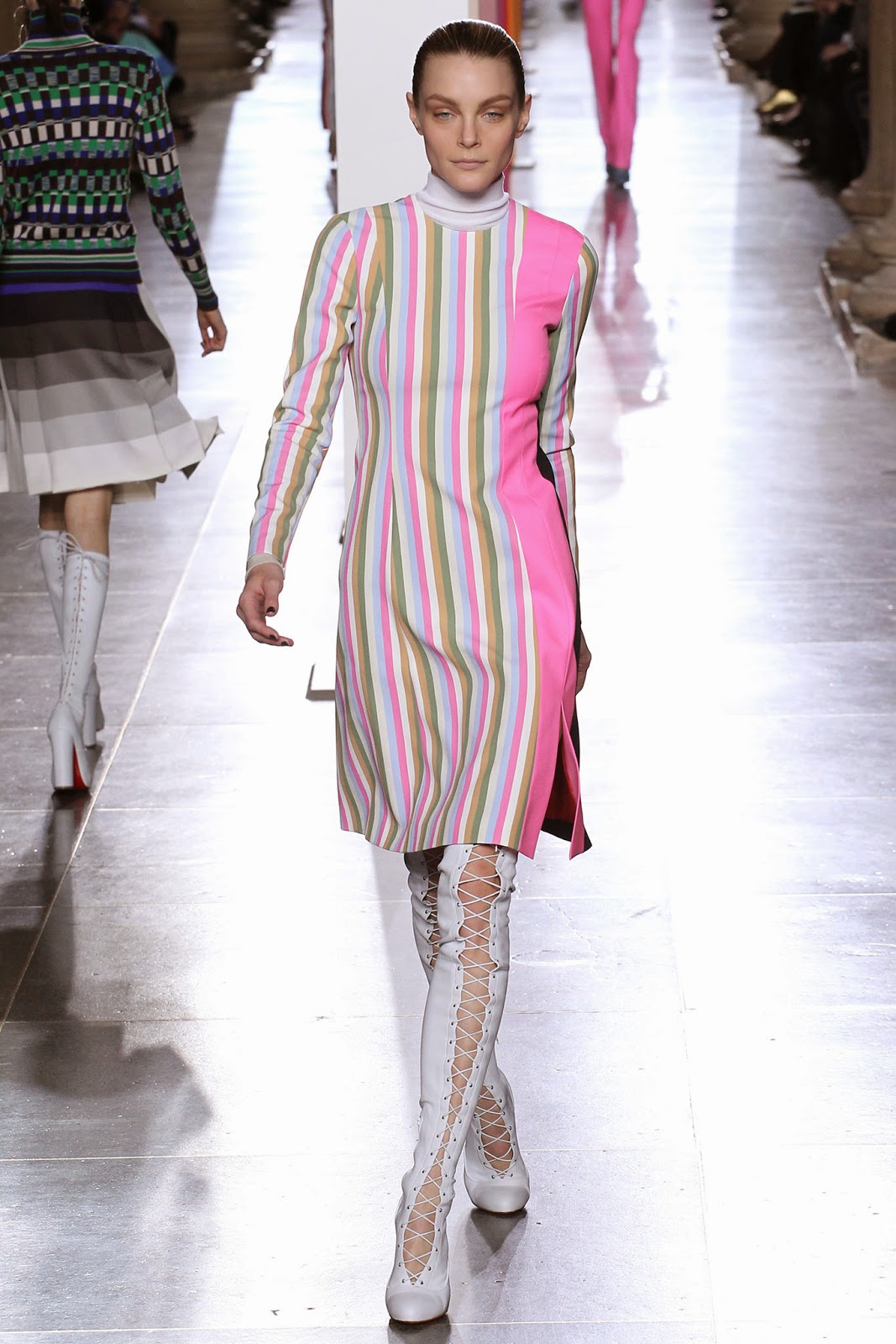
 *Images via Vogue.com
 Conceptually, Acne are one of my favourite brands. They have an obvious cult following around the world and exude 'cool' from every pore. Yet whenever I scour eBay looking for cheap second hand pieces I always feel uninspired when the clothes are removed from their fantastical environment of runway shows and ultra chic look books. There isn't really a concrete reason as to why I feel uninspired when viewing the same object, other than curating and executing an idea is the key to any brand or blogger's success. It's for this reason that Fall collections are probably my favourite- since there are so many ways of layering and styling each piece. Acne have always done an excellent job creating crazy new shoes which seem strangely futuristic in comparison to their classic woolen coats.


 I'm obviously obsessed with the tongue in cheek 'Say No To Drugs' coat from this collection, but the tights and sneakers combinations is worth borrowing. Tbh I haven't bought a pair of chunky sneakers since I was in high school and styling them terribly but I'm kind of inspired now. Goodness knows I have to make the best of the next couple of months of mild weather before Summer starts and it's too hot to go outside. Another reason why I fawn over Fall collections but meet Resort/ Spring-Summer/ Cruise with some kind of dread and apprehension. For those with a 1960s mod fascination, Acne also made some slamming knee high boots with kooky concealed platform heel and silhouette. I wonder if these clothes are as dreamy in person as they appear under the intense studio lights.
*Images via Vogue.com


 I didn't think it was possible, but a brand has built their reputation on being polished and yet eccentric all at once. At the core of it, the clothes are to the highest standard but the styling is both weird and wonderful. From bowl cuts with purposeful cowlicks and buzz cuts, traditionally masculine haircuts have been softened and the notion of gender blurred. The result is wonderfully eccentric, and pants shrouded by long coats looking not too dissimilar to skirts with deep splits. Also for those concerned with ~trend reports~ (though I despise such superficial, clickbait garbage) pointed shoes are back in vogue. I loved the thick elasticised ankle straps and frayed edges characterising the Acne Resort collection. Like normal people, I do not enjoy sliding around in shoes which do not fit properly, or imagining my shoes slipping off my feet and into a nearby gutter. Unlike thin straps they also don't cut into the skin, although they do result in some interesting tan lines. Tattoo chokers have also enjoyed a recent revival and Acne have done just that- translating something tacky into high fashion.


