skip to main |
skip to sidebar


 Wearing: Target skirt (worn as dress), Asos Mimi pointed flat shoes, Karen Walker sunglasses and thrifted bandanna.
I submitted my thesis last Friday but haven't been able to capture my outfit within recent days. As you can see I'm back at my boyfriend's beach house, standing in front of the long grass on the vacant block. In the weeks leading up to my final submission I really took to wearing a bandanna with a plain black shirt and black jeans. There wasn't really any time for the frivolity and escapism of fashion, but I did accessorize a little more than usual and applied red lipstick on a number of occasions. I guess what I was looking for was a way in which I could feel powerful. Wearing a flimsy dress (or rather, skirt as a dress) doesn't necessarily make me feel powerful, but it is, in its own strange way, a luxury. I did really want to wear a pair of clunky shoes (either my Nicholas Kirkwood x Rodarte booties, or J.W. Anderson mother of pearl shoes) but they kind of exaggerated my legs and made the dress look even shorter! It's actually a skirt, but since I don't have much in the way of a bust it's something I can get away with, however, some sort of elastic would make it fit a little better.
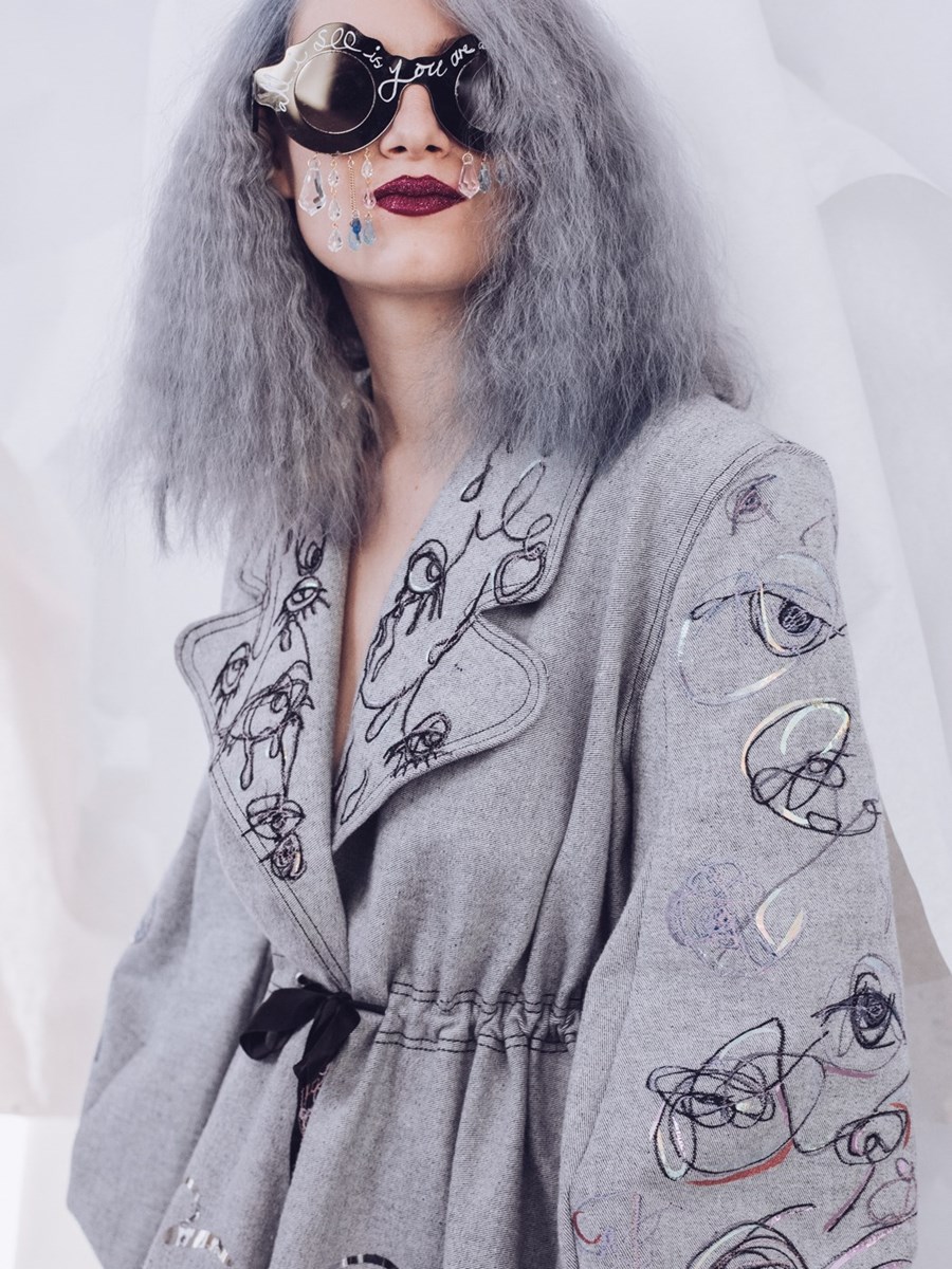
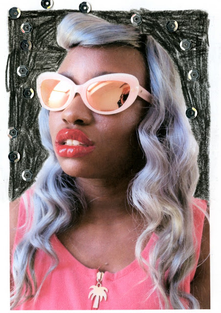
 Lately it's been easier to aesthetically cataloging various fashion collections instead of exhaustively reviewing them. The words aren't coming easily. I've put a lot of pressure on myself to maintain this blog and make it as good as I feel it can be. But doing all that whilst still trying to write my thesis/ apply for a PhD/ apply for jobs isn't easy either. While I've always had the opinion that blogs which don't, at least sometimes have a strong written component I'm beginning to see visual expression as valid as written content. To celebrate Mary Benson's Spring 2016 collection, I searched for images from Rookie Mag but some Hole references for good measure. The motifs on her clothes, emphasized using glittery holographic foil, as well as crystal embellished sunglasses celebrated emotional outpourings. I love her fantastical designs, and to see someone celebrate gushing tears down models faces gave validation to every time I had to run to the bathroom and cry.


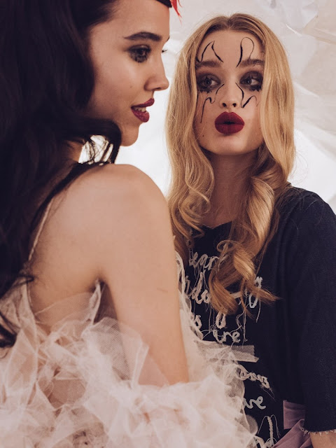


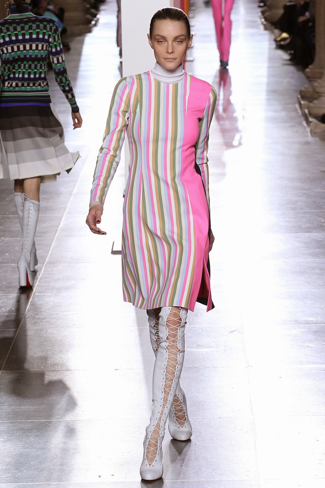
 Aside from the tears and glitter, another motif from this collection were the creepy eyeballs. It almost exists as an extensive of the land of Oz, populated by living forests. This time each eyeball pertained to a globular flower or bush. Since it's October (and Tumblr has become one big advertisement for pumpkins and skeletons), I can openly appreciate things which are both beautiful and creepy. It seems that cartoon lips and eyes will continue to be popular with fashion designers and artists on etsy and I for one couldn't be more excited. Unfortunately it seems that noses aren't as popular, in fashion or on instagram but I'm going to keep hoping I see them up there one day (!!) Anatomy aside, it was cool to see bell sleeves and raw denim jackets with a difference, amongst all the 1970s hysteria that the fashion world seems heavily tied up on. It was cool for the first couple of months, but I'm wondering what Topshop will stock once the gravy train is over and people are looking for The Next Trend.




 Wearing: Target skirt (worn as dress), Asos Mimi pointed flat shoes, Karen Walker sunglasses and thrifted bandanna.